Updated
3 imagicle steps to designing a strong user experience.
Consistency and ease in the user experience are huge undertakings, but here at Imagicle we have embraced them! In fact, UXD is fully integrated within our Agicle process: the 9 phases of the UX are treated as an item in a product backlog and managed as any item during the entire development lifecycle of a feature. Find out our three Imagicle steps to provide relevant and significant experiences to users based on their behavior analysis, improve the way they interact with the apps and thus enhance overall user satisfaction.
User Experience: 3 Imagicle steps.
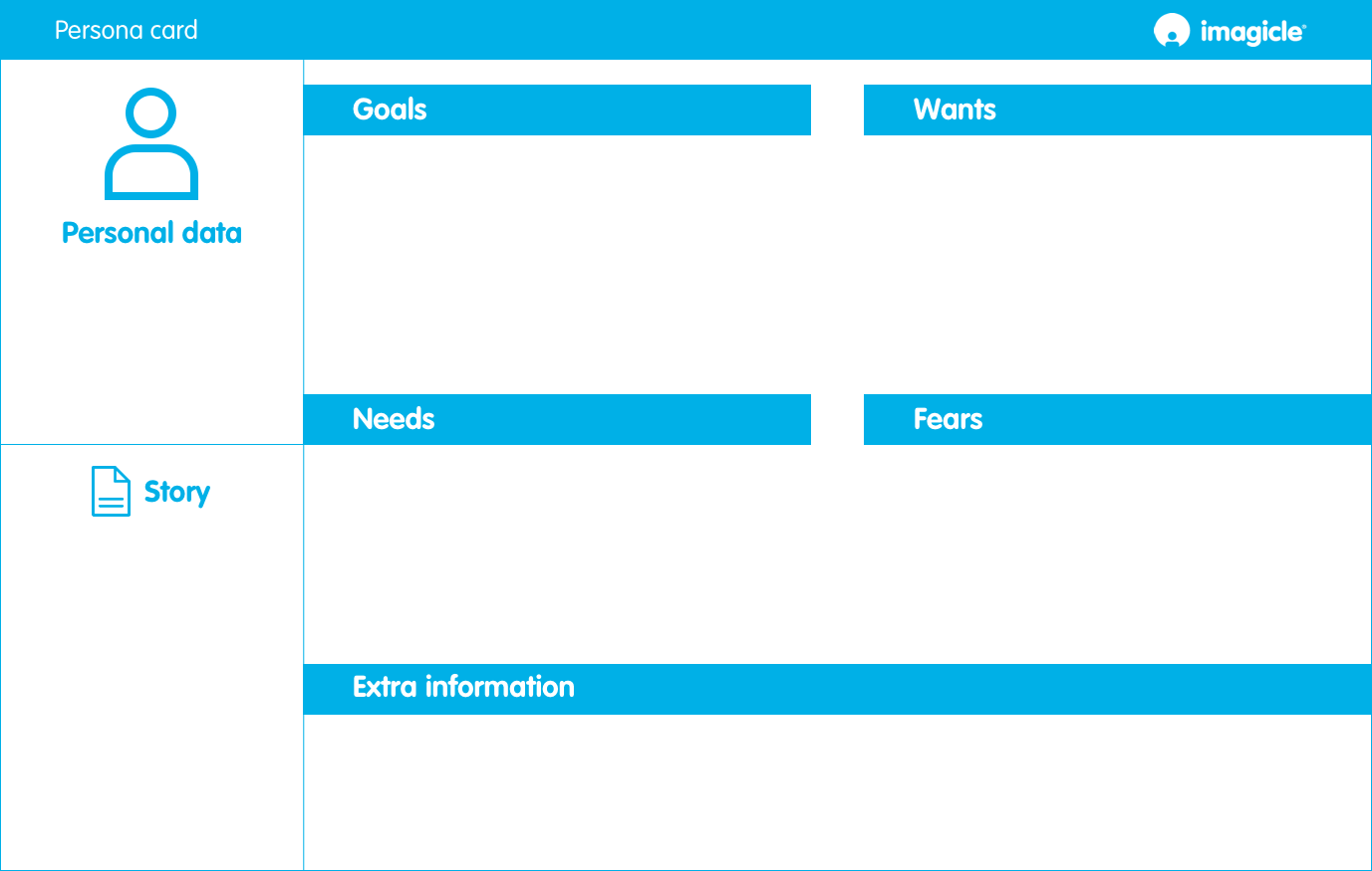
Step one: user stories.

Step two: user flows.
Thanks to case studies, usage data, interviews, and studies of psychological profiles, we can trace the paths, identify the key points, and start evaluating the scenarios we have imagined.
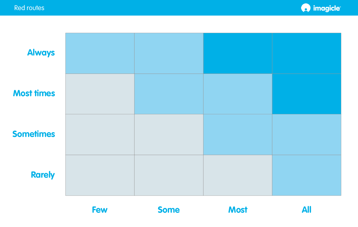
Step three: red routes.

So does it all end here?
Not at all! From here on, everything becomes more colorful and detailed, and our ideas can finally take shape turn into reality, entering fully into the Agile development process as described in the posts collected in our Agile Handbook.
You might also be interested in…
-
Products Blog
Cloud or Dedicated Cloud. What’s best?
Cloud or Dedicated Cloud. What’s best?You're migrating to the Cloud and you need to choose between a public or private instance? This article will help you. -
Products Blog
Imagicle Attendant Console for Webex Calling: the operator console that was missing.
Imagicle Attendant Console for Webex Calling: the operator console that was missing.Discover a new native integration. Attendant Console is fully compatible with all Cisco platforms! -
Products Blog
Voice Analytics: designed for your privacy and security.
Voice Analytics: designed for your privacy and security.Voice Analytics handles a variety of sensitive, personal data. Learn why you can trust it to do so, any time, anywhere.
Products Blog
Cloud or Dedicated Cloud. What’s best?
Cloud or Dedicated Cloud. What’s best?
You're migrating to the Cloud and you need to choose between a public or private instance? This article will help you.
Products Blog
Imagicle Attendant Console for Webex Calling: the operator console that was missing.
Imagicle Attendant Console for Webex Calling: the operator console that was missing.
Discover a new native integration. Attendant Console is fully compatible with all Cisco platforms!
Products Blog
Voice Analytics: designed for your privacy and security.
Voice Analytics: designed for your privacy and security.
Voice Analytics handles a variety of sensitive, personal data. Learn why you can trust it to do so, any time, anywhere.


0 Comments