Step two: user flows.
Thanks to case studies, usage data, interviews, and studies of psychological profiles, we can trace the paths, identify the key points, and start evaluating the scenarios we have imagined.
Here the horizon begins to lighten, and we start seeing the first practical applications of our features. We can now analyze the problems in detail and set the first metrics that will allow us to ascertain whether the results obtained reflect the users’ expectations.
In an early stage, user flows can be represented as flow charts. The simple structure of the flow charts allows you to concentrate better on the passages and on the various roads that the use of a feature can take.
Here are some examples:
- What happens if the user presses the button?
- And if he/she presses another one?
- Once the operation is completed, what type of feedback should he/she get?
- If he/she doesn’t complete the operation, can he/she resume it later?
And so on…
It is a continuous matter of questioning, progressing, validating, reworking, modifying. As long as all the pieces of the puzzle aren’t in place and the flow isn’t clear and functional, you can’t proceed to the next stage! The story must progress smoothly from the start to the end, from the entry point to the exit point, evaluating all the middle conditions that can intrude or facilitate this journey.
Details such as animations, microcopies, and graphic elements will be inserted and evaluated only later. They can wait: here we are working on the real user experience, the one that gives added value to the product.
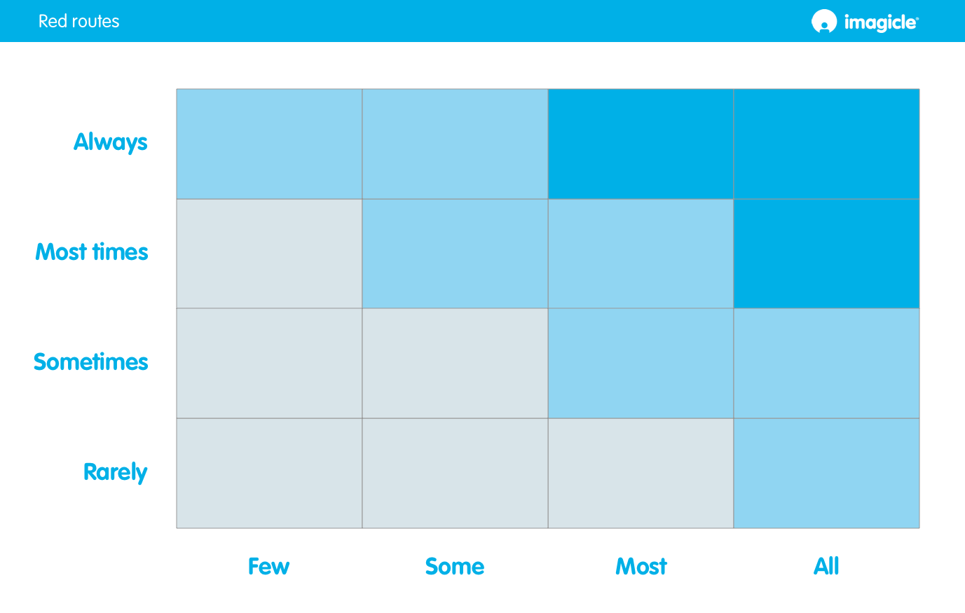
As the flow takes shape, levels of detail are added: you start knocking out wireframes, thinking about the hierarchy of information and consolidating the user journeys. Now that we have all the elements to make our assessments, we can move on to the next step: Red routes.


0 commentaires