Greta Babbini Greta Babbini - 20 Maggio, 2020 - 5 ’ read

Three more bites to Imagicle’s Design For People process.

The recipe of Imagicle UX design: from Planning to Exploration.

 
Following the introduction to the first 3 phases of the UX design process, which you can read in full here, it’s time to give three more bites to the cookie of the UX of Imagicle products.
 
In Fabio’s article, we shared the preliminary concepts of the Planning phase, namely the moment in which the experience design process comes to life. We understood how to know, how to transcribe, and how to segment the wealth of knowledge and needs of our users and interlocutors, turning it into workable material for the next steps.
 
To power up a new phase, we have 3 more tools to fine-tune our Imagicle design recipe
 
After Planning, we have the Exploring phase
The term exploration does not mean a completely free investigation but research supported by the information consolidated in the Planning phase.
 
In this article, we will see the three steps of the Exploration phase:
• Brainstorming & sketches;
• Wireframing;
• Prototyping;
 
 
Ready?
Fasten your chef whites! Let’s go!

Exploration – Phase 1: Brainstorming & sketches.

This is probably the freest and more creative phase. Especially at the beginning, it’s essential to consider every idea that arises from a close reading of the requirements of new functionality and the characteristics of the user profiles involved.
Given this, there are many techniques, individuals and collective, to generate ideas that are not just a chat in a meeting room but that gives some tangible results that can be modified, worked on, destroyed, and evolved.
Based on the starting level of detail, we aim to:
  1. Create maps to tell why a certain choice is proposed;
  2. Define diagrams to describe the relationships between the concepts more and less distant from the problem in question;
  3. Outline which aspects, actions or interactions cannot be missing and which will have lower priority;
  4. Prepare storyboards for use or interaction with functionality.
Fundamental aspects of this phase are:
  • Involving the right stakeholders (the audience may vary from users to colleagues from different departments);
  • Encouraging free expression and the integration of ideas and proposals;
  • Nurturing the “think out of the box” mindset by promoting an unconventional approach in elaborating new ideas and interpreting the request.
But how can we make everything tangible?
Often the greatest effort required to the participants of these design activities is to put their idea on paper.
 
The most immediate and unpretentious technique is simply sketching
With a few pens and colors, anyone can be proactive and find his/her communication register.
We practice sketching because we consider it a valuable exercise to express ideas and potential solutions using rough diagrams and sketches rather than just using words.
Visuals can generate further ideas and providing a wider lens of thinking.
The request for sketching out ideas is not to develop beautiful drawings to hang on the wall. They should be as simple and rough as possible, with just enough detail to convey meaning.
In short, some sketches in exchange for coffee and pastries offered to the participants seems to be a good compromise.
 
This technique helps us to focus on possible positive paths and to abandon, in advance, suboptimal design choices.
Sketches can be the key to explore and collect concepts without worrying about their quality. They encourage our participants to discuss, compare, and analyze solutions in a more critical sense, understand their potential constraints and strengths.
That’s why sketches are a great tool to help us choose which ideas are worth pursuing.

Exploration – Phase 2: Wireframing.

When good paths are identified, it’s time to start being more objective. 
At this stage, constraints are essential to be sure that free and creative ideas become concrete.
To do this, we start talking about structures and layout. Ideas must be translated in terms of pages and components according to the current product user interfaces. This activity is what we can call the wireframing phase.
 
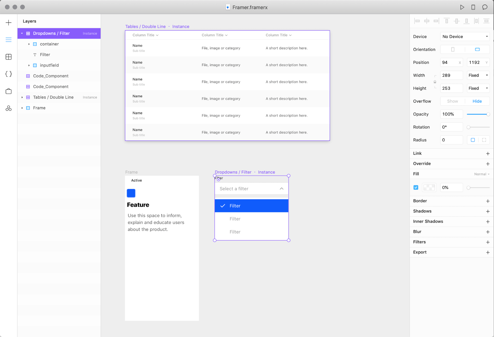
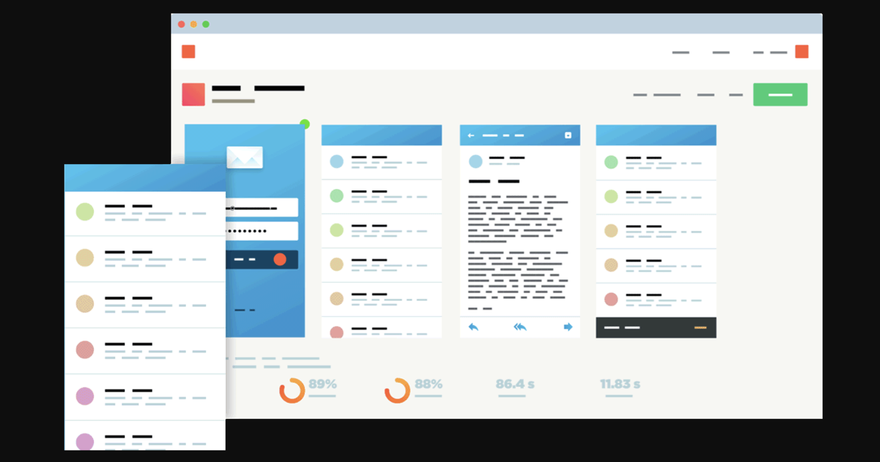
A wireframe is a visual representation of a user interface, stripped of any visual design or branding elements. It is used by designers to define the hierarchy of items on a screen and communicate what the items on that page should be placed and organized, all based on user needs.
Wireframes can stretch from a low fidelity pencil sketch to high fidelity and fully annotated series of screens.
They are useful for a number of reasons:
  • Build the basis to begin creating screens;
  • Define a reference point for functional specifications;
  • Communicate and discuss the functionality with stakeholders without diverting the attention with visual design or branding elements;
  • Explore and consolidate ideas according to current or new ideas of interface;
  • Start earlier testing activities to enforce or reject proposals.
So, build to think. From low to high fidelity, we work on each strong idea according to the user flows defined during previous stages; the goal is always to design and test the best and effective proposal without forgetting feature requests and target needs and preferences.
Like the other design activities, Wireframing is a cyclic activity. Each material is drawn, evaluated, and tested (with final user or different stakeholders) since the best interactive structure is found.

Exploration – Phase 3: Prototyping.

“Ideation is the mode of the design process in which you concentrate on idea generation. […] Ideation provides both the fuel and also the source material for building prototypes and getting innovative solutions into the hands of your users.”
Once a consistent structure and interaction have been defined, prototyping is the next and inevitable step.
Three more bites to Imagicle’s Design For People process.
A prototype is a model created in the last phase of design and experimentation; by its nature, it is destined to become the starting point of production. By applying the classic cycle of “draw, evaluate and test”, through more or less detailed processes, it will end up containing everything necessary to create a concrete, feasible, and effective proposal.
Three more bites to Imagicle’s Design For People process.
Compared to previous productions, the prototype can reach a level of detail that allows an interaction so fluid as to seem like a real product. This fluid usability between tester and product allows us to check and work leanly on improvements and modifications that are no longer structural but useful for refining interaction or user experience in general.
 
In general, in the Exploration phase, the highlights and the questions to keep in mind are:
  • Does the solution we are working on meet the most stringent needs of the target?
  • Is the new functionality outlined to prioritize key information and actions?
  • Have I considered all users and their ways to use and approach this functionality?
  • Does the proposal cover both conventional and less canonical/unpredictable use cases?
  • Have I left out anything? If yes, why?
 
We are committed to keeping all these aspects in mind to be sure that our design process can provide effective, usable releases that are in line with our users’ expectations and needs.
It is our constant commitment; we are glad to tell and enhance it in order to share as much as possible our intentions and our positive approach to a design that doesn’t think only in terms of “customers” but aims to create for people.
 
Stay tuned to discover the next phases of Imagicle’s design for people process.
#stayimagicle

0 commenti

Potrebbe interessarti anche...

Resta sempre aggiornato sul mondo Imagicle
Iscriviti alla newsletter per ricevere interessanti contenuti sul mondo delle communications & collaboration.
This site is registered on wpml.org as a development site. Switch to a production site key to remove this banner.